Less Confusing Digital Ocean Menus
Extension Actions
CRX ID
fbcimbafahpbjimdoonmmjjngjcdoodb
Description from extension meta
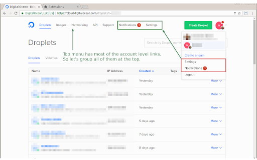
This extension makes the Digital Ocean menus less confusing.
Image from store

Description from store
I manage more than 100 DO droplets across several accounts and 1 team and their navigation always confused me.
This simple Chrome extension makes the Digital Ocean account menus less confusing:
* Moves Settings and Notifications to the top menu where they belong
* Renames Settings > Notifications to Settings > E-mail subscriptions which is where it actually takes you
Source code: https://github.com/addpipe/Less-Confusing-Digital-Ocean-Menus