
Temporary Mobile View
Extension Actions
- Extension status: Featured
View current page in the mobile-friendly format by spoofing Android or iOS user-agent string on request header and JavaScript sides
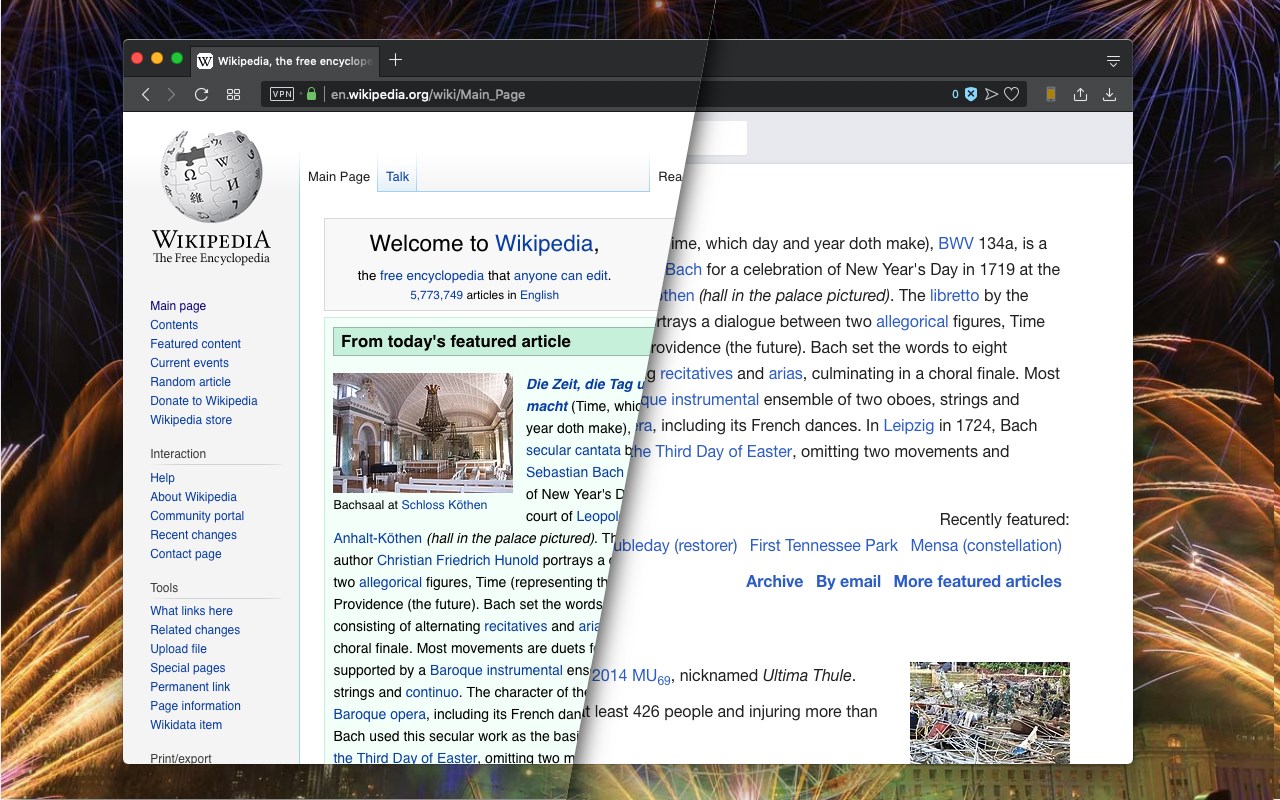
This extension toggles a website's view to its mobile version if the server supports a mobile-friendly option. Please note that this change is temporary, and you can return to the default desktop view by clicking the action button once more. Additionally, you can select different devices, such as Android, iOS, and Kindle, from the right-click context menu. The user-agent string for each device can be configured on the options page.
Important Points:
1. Users can insert custom CSS rules when switching to mobile view, which can help adjust the browser window width or customize font settings (not available on the manifest v3 version yet).
2. To revert to the regular mode, click the browser's action button.
3. To switch between view modes, use the right-click context menu options.
4. Some websites employ distinct URLs for their mobile-friendly versions, often redirecting users to the mobile version (e.g., en.wikipedia.org => en.m.wikipedia.org). In such cases, even after a refresh, you will remain on the mobile-friendly hostname. Be sure to correct the address in the address bar before refreshing the page.
Latest reviews
- Brian
- Exactly what I needed.
- Frode
- Not recommended as it does not give you any indication on if the content scales the way it should on other devices. Hint. Look for Mobile Simulator on Chrome Web Store
- Faith
- Works as intended
- Lucas
- 2023, does not work.
- Wayra
- Works wonderfully