
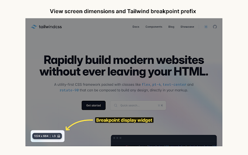
Tailwind responsive breakpoint display
Extension Actions
CRX ID
incikpedlilahccgpfpgknfpokibpfij
Status
- Live on Store
Description from extension meta
Display screen dimensions and tailwind breakpoint prefix.
Image from store
Description from store
Display screen dimensions and Tailwind breakpoint prefix on all sites.
This extension makes it easy to find the screen dimensions of your browser. This comes in handy when you are building your UI with Tailwind CSS and making it responsive.
Enable dev mode to display the widget only in local environments (Localhost & 127.0.0.1)
Enable/Disable on .test TLD.
Add custom breakpoint values.
Extension built with chromekit.dev
Latest reviews
- Jelle Wielsma
- Great extension. Simple and effective. One suggestion that would make it perfect: provide the option to add custom TLD extensions instead of the fixed .test extension. My LocalWP sites for example are all provided with a .local extension but are not recognised by the extension as a local installation.
- ROHAN NIKUMBH
- not working
- Bruno Silva
- Amazing, this extensions is boosting my development of responsive layouts! I would give 6 stars if it possible lol
- Cosmic Egg
- simply awesome bro
- Ryan Mortier
- Perfection
- Sjoerd Stottelaar
- Does what it needs to do, fully customizable and looks great as well. Thanks!
- Alec Hale-Pletka
- Phenomenal. Simple, effective, clean. Exactly what I needed. There's a Github repo where you can roll your own but this is much more intuitive. Helps with debugging because now media breakpoints are included in every screenshot.
- Zeke Dou
- Thanks for this clean extension. I'd like to suggest another feature - custom breakpoints, because there are projects which are not using the default breakpoints. I would be nice if this extension supports something like https://chromewebstore.google.com/detail/tailwindcss-media-query-v/knngcflccjebacgmbcbbihcgfcndggjp
- Vladimir Struhar
- Simple and effective, thanks! I would suggest to auto enable widget on .test tld, localhost (127.0.0.1) is almost never used in my web dev workflow.