
Responsive Tester
Extension Actions
CRX ID
clblmebfjgiachgagonndijhdgpnkkjd
Status
- Extension status: Featured
Description from extension meta
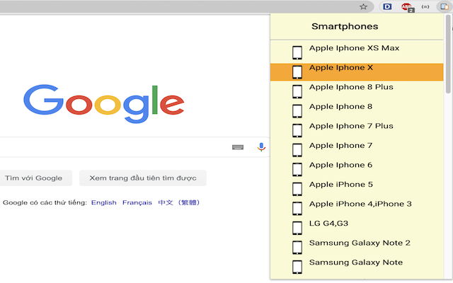
Test responsive web desings or mobile pages and test for multiple devices
Image from store
Description from store
The Mobile Friendly Tester extension allows Web Designers and Developers to test their web pages against common mobile, phablet and tablet devices by emulating the user agent and screen resolution. Excellent for testing responsive web designs. Easily switch between portrait and landscape mode and test multiple mobile device's at the same time! Try it now.
Latest reviews
- Kachi-Nwoga
- This is the best I have seen on edge. I've scanned through a lot and this by far is excellent.
- Osezua
- Useless. No Offense! It only shows size
- Hartanto
- It's highly useful for doing qualified website improvement.
- Kami
- Sehr rudimentär und überhaupt nicht innovativ. Auch nicht User-Freundlich.
- maulana
- nice
- lin
- 很好用的工具,提一个建议,可以加一个开关来展示是否默认打开F12调试工具,这样对开发人员会非常友好,建议右侧贴靠
- XP
- 非常好用,简单
- chelton
- I just like the extension and it is helping me a lot joining with Microsoft edge! So I think you guys must improve the style of the extension.
- Willem
- Great tool to compensate for the lack of mobile user friendliness when browsing in portrait mode with a Surface Pro .. One wish though: A preset at the top of the list, so that one does not have to scroll down every time when wanting to switch to for instance iPad mode ... (If possible even a setting that allows for 1-click mode switching :-)
- Thomas
- Needs an update. Please add all the iPhone 12 models.
- xu
- 不错很方便