
CRX id
kbmbhimecdojfckfkfkaffgihnbfaefj
kbmbhimecdojfckfkfkaffgihnbfaefj
Description from extension meta
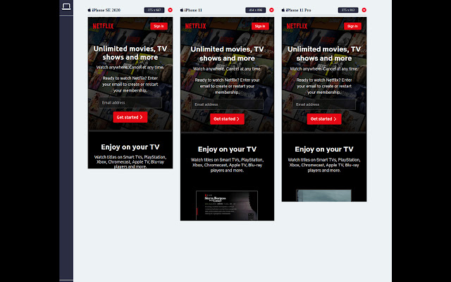
Develop mobile and web responsive UIs simultaneously with multiple device viewports
Image from store
Description from store
Compare responsive web designs on all devices at once!
- 👀 Display multiple devices side-by-side
-📱Develop and test for mobile, tablet, and desktop simultaneously
- ♾️ Unlimited devices on screen
- 🔥 Hot reloading support
- 🚀 Choose from many devices and device types
- 🛝 Slides into your existing developer workflow without any changes
- 🔁 Synchronised device scroll
Enhance your development workflow by activating the extension and instantly previewing your site on multiple device screen size simultaneously, side-by-side in a single tab.
There are clever tricks implemented by this extension to get you as close as possible to a real device - you cannot beat this without utilising a real device emulator such as BrowserStack.
This extension should be used during all stages of development in addition to a tool like BrowserStack.
DeviceView currently features 17 Apple iPhone viewports, and 5 iPad viewports, with plans to expand to Android, Tablets, and Laptop views.
Roadmap:
- 🐞 Bug Fixes
- 🧮 Many more devices
- 📷 Device screenshots for marketing
- 📹 Video recording
- 🧭 Toggle device orientation
- 📦 Sort and group emulated devices by name, brand, type, and size
- 👑 Device Skins
Latest reviews
- (2023-06-13) Rodrigo Novaes: Amazing stuff, super useful extension! I can't live without it!
- (2023-06-11) cc tt: This is an exceptional extension that will allow you to design and test your own websites faster. Stay tuned for single click marketing videos and screenshots!