
Breakpoint media-queries
Extension Actions
Generate media-queries, show screen sizes width and link to a list of media-queries snippets.
The extension generates media-queries for using max-width, helps you see the current screen size width and link you to a list of media-queries snippets.
1. Add the extension to your Google Chrome browser.
2. Start resize your window and see where your content are breaking.
3. Click into the Breakpoint icon.
4. Click "generate code".
5. Copy the code generated.
6. Past into your style sheets.
Pretty simple and useful.
Version 1.0:
- removed Jquery
- re-built with vanilla javascript
Version 0.7:
- Design improvements.
Version 0.6:
- Design improvements.
Version 0.5:
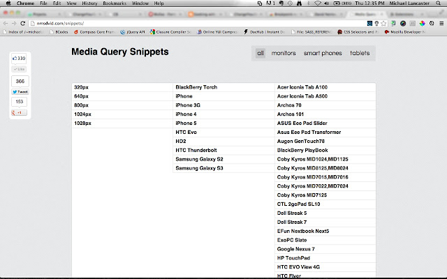
- Added external link to media-queries snippets with a bunch of devices.
- Design improvements.
Version 0.4:
- update from min-width to max-width.
Version 0.3:
- icon updated.
Credits:
Thanks to David Nemes for the Media-Queries Snippets.
Latest reviews
- Norbert Akonsi
- Love it, great results
- Norbert Akonsi
- Love it, great results