
Responsive View
Extension Actions
CRX ID
hgeefdjnmmeindmchabjodoggbfkhaam
Status
- No Privacy Policy
- Live on Store
Description from extension meta
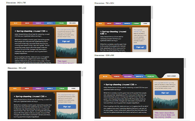
To view the page in different device screen sizes, just by a click
Image from store
Description from store
This extension gives you an ability to view the page in different screen sizes, just by a click.
HOW TO USE: Go to the page that you want to view in different screen sizes. Click on the extension icon and scroll vertically.
Various screens sizes that are available as follows:
1. 340 x 480 - Mobile
2. 480 x 640 - Mobile (larger screen)
3. 768 x 1024 - Tablet (Portrait)
4. 1024 x 768 - Tablet (Landscape)
5. 992 x 640 - Bootstrap
6. 1200 x 800 - Desktop
Latest reviews
- Alexey
- Несколько фреймов разного размера - это ничего общего с мобильным видом
- Pocari
- Very helpful and easy to use! Thank you sooo mush ♪
- Pocari
- Very helpful and easy to use! Thank you sooo mush ♪
- Harshada Firake
- Nice
- Harshada Firake
- Nice
- Jey Si
- Can it open in the new window?
- Jey Si
- Can it open in the new window?
- deepeka shah
- Helpful, Liked this extension
- deepeka shah
- Helpful, Liked this extension
- sameer uttarwar
- Very helpful and really good extension....like it.....
- sameer uttarwar
- Very helpful and really good extension....like it.....