
Material YouTube - dark
Extension Delisted
This extension is no longer available in the official store. Delisted on 2025-09-17.
Extension Actions
CRX ID
dnaplngkmgnmcngphjogbggeifeglfba
Status
- Minor Policy Violation
- Removed Long Ago
- No Privacy Policy
Description from extension meta
Change the appearance of YouTube in material design and in a dark theme
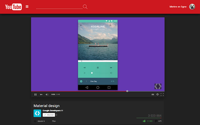
Image from store
Description from store
This extension change the appearance of YouTube in material design. The new design is more dark, so the videos will be really more visible. This design also reorganize the "watch" page, so you can quickly view other videos you might like. Finally, the playlist reader was moved so you can see more clearly the video and the playlist.
You'll go to a new youtube tab, when you clic on the extension icon.
Extension created by http://renseign.com/
Latest reviews
- Muhammedatmaca YT
- güzel <3
- Funky Pringles
- Everything was all over the place, wont recommend this extension.
- Anonymous
- Beautiful theme but no comment section and overlapping etc...
- rawpie
- Extremely broken
- SOZ I KILL YOUZ
- Everything works fine until you want to watch a youtube video... the video seems to overlap the title and the up next is way off to the left, etc.
- Константин Золотарев
- Во время просмотра видео ниже предложенные видео наезжают друг на друга и вбок.
- Isaac Parker
- Doesn't work correctly!
- Anonymous
- Çok güzel
- Carl Malmgren
- Does not work
- Bunny
- It screws everything up. As soon as I click to watch a video, everything beneath the video is overlapping, all the videos that should appear on the rights side are beneath and overlapping each other. The text is also doing the same thing and there's no comments section. A complete mess. Sorry, but this is the truth. The colors and the whole idea, are great but that's all.
- Anonymous
- AMazing theme but no comment section
- Anonymous
- Looks disorted, lacks comments. But it looks great.
- Martin "
- puro bug
- Владислав Арефьев
- I think on the attached screenshot, everything will be clear http://prntscr.com/agvivc I hope it will be fixed soon
- Joan Sander
- Pages don't display content properly.
- Evilix Mania
- very good but where is the comments ?
- Konstantin Baratashvili
- Very simple and beautiful app!!! Keep work on it! Best! 5 stars
- MRNIKUSHA101
- NOT BAD
- Marnix van Dorth
- Great theme but missing the comments section?!
- Justin Bolz
- Looks amazing, but zooming in/out on the page mucks everything up. It's hard to read text on the youtube settings page. Having fancy options to hide comments, auto-select player size and resolution would be nice.
- Nick Orie
- A lot of the text is misplaced when you zoom in. Also, the hamburger menu icon and search icons etc need to be higher resolution. Looks beautiful though
- Bassam Soussi
- Good design but the suggestions on the videos are messed up and there's no comments FIX IT
- Conige
- Sympa Pitouille, bravo ! :-)