Frag | Improved ESEA
Extension Delisted
This extension is no longer available in the official store. Delisted on 2025-09-16.
Extension Actions
CRX ID
bmmkfncdfhjkefffchcghkbaidjpkhac
Status
- Minor Policy Violation
- Removed Long Ago
- No Privacy Policy
Description from extension meta
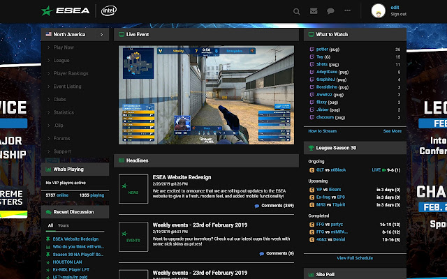
An unofficial dark mode extension to improve quality of life on ESEA.net with a focus on clean aesthetics and legibility.
Image from store

Description from store
*WORKS FOR 2019 ESEA UPDATE*
Dark theme and enhancement suite for your ESEA experience. Cleaner, larger fonts, slightly changed color scheme and focus on flat design.
Primary features:
- Dark theme
- Crisp, legible font
- Removal of gradients, box shadows, etc.
- Cleaner charts and graphs
Created by Erik "edit" Slatter
https://twitter.com/erikslatter
Not affiliated with ESEA, ESL or Turtle Entertainment in any way.
Latest reviews
- Lumpy
- pretty good but needs work the inverted colors look off at some parts and id like options to not do inverted basically just needs more customization options other than that its great
- Mark S.
- Getting rate limited regularily due to the extension requesting rank information repeatedly. It lists me the same rank 5x per player, making me get banned temporarily. Other than that, decent theme! GJ
- Smithy Vlogs
- love it
- Spenser Adams
- names shrek
- Will Apathy
- Simple, dark esea theme. Does what it's supposed to.