
Emmet Re:view
Extension Actions
- No Privacy Policy
- Live on Store
Fast and easy way to test your responsive design in multiple viewports
Emmet Re:View displays your responsive web-page in a number of views side-by-side so you can quickly test how web-page looks at different resolutions and devices. All views are fully synchronized: scroll, fill-in form fields, click, hover and drag elements in one view and get instant feedback in all others.
Features:
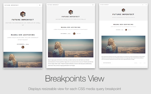
* Breakpoints View: displays resizeable view for each CSS media query breakpoint of your page. Contents of large viewports are dowscaled to fit your screen size.
* Device Wall: bird’s-eye overview of device-sized viewports. In this mode, each view is scaled according to <meta name="viewport"> tag of your page and overrides User-Agent with real device value.
* Create your own devices and presets for Device Wall.
* PageSync engine synchronizes all user interaction across all viewports: not just scrolling, form fill and clicks but also mouse hover, movement and dragging.
Latest reviews
- Lernschau
- It's free so... 1 star for that. Using the existing media queries is a beautiful idea another star, however .... it would be much more useful if there was also a way to toggle between portrait and landscape in the Device Wall, if devices could be picked (no need for 5 viewports all around 360px) and above all: if viewport sizes weren't written in a light gray 6px font that's covered by a drop shadow. it's virtually impossible to see where a breakpoint might be required if the device size is just a blob of blurry pixels. Simply put that label on top of the device.
- Samuele gg
- • Un pò lento a visualizzare i modelli, andrebbero migliorate le prestazioni • mancano le risoluzioni per il desktop Migliore dell'estensione "I love adaptive" poichè possiede tantissimi modelli di Iphone e Samsung da verificare/confrontare, non ti si apre una nuova scheda e puoi creare profili. __________________________________ • A little slow to display models, performance should be improved • desktop resolutions are missing Better than the "I love adaptive" extension as it has many Iphone and Samsung models to check/compare, a new tab doesn't open and you can create profiles.
- Fady
- I like this tool, i have found a bug or what can you say it is, when i click any link any of mobile screen then after landing that page all screen stop work together i mean they lost ability of scrolling you have to scroll each of there one, please fix it or let me know the solution for it. Thank you!
- Mark Kimitch
- It needs a serious overhaul; it hasn't been updated in a looong time. It basically doesn't work at the moment.
- Mark Kimitch
- It needs a serious overhaul; it hasn't been updated in a looong time. It basically doesn't work at the moment.
- Nathan Wright
- Fantastic extension. Makes developing responsive sites so much easier. Only thing I would change would be adding a way to add a custom order to devices within the custom groupings that I create, rather than displaying viewports based on their alphabetical naming.
- Nathan Wright
- Fantastic extension. Makes developing responsive sites so much easier. Only thing I would change would be adding a way to add a custom order to devices within the custom groupings that I create, rather than displaying viewports based on their alphabetical naming.
- Paul Driver
- Brilliant
- Paul Driver
- Brilliant
- Anonymous
- Una maravilla
- Anonymous
- Esto es una p... gloria. La usamos cada día en nuestra empresa para maquetar y es la gloria :) squaads.com
- Vidyu Krastev
- Sehr hilfreich. Dazu mit schönes Interface!
- Erimus Koo
- Some request: - viewport support(it's important for mobile device) - in page refresh (not refresh and active extension again) - smaller (or control able) margin. (now it's auto fix window, most time reduced preview)
- Erimus Koo
- Some request: - viewport support(it's important for mobile device) - in page refresh (not refresh and active extension again) - smaller (or control able) margin. (now it's auto fix window, most time reduced preview)
- Ning Cao
- good
- Ning Cao
- good
- Emil Atanasov
- Good
- Emil Atanasov
- Good
- Bryan “Bevans” Evans
- This used to be a very useful plugin, but it hardly ever works anymore. The Breakpoints View almost never works, and the Device View is only a little better. Judging by Github, the code hasn't been touched in over 3 years, so this has probably been abandoned. Hopefully the creator (or someone else) updates it, because it was a great tool when it worked.
- Stéphan Herby
- J'aime cette extension : elle a une interface élégante et ne plante pas. C'est un moyen rapide et efficace de vérifier les sites responsives.
- Satyen Dhingra
- just the tool I neede to test my app on various screen sizes..worked like a charm
- Satyen Dhingra
- just the tool I neede to test my app on various screen sizes..worked like a charm
- Jamal A
- I love this extension for testing websites. Great work! Only questions: How do I change the orientation of the tablet from landscape to portrait?
- Jamal A
- I love this extension for testing websites. Great work! Only questions: How do I change the orientation of the tablet from landscape to portrait?
- Stefan Reichelt
- Good tool for the most part. Output for every device is shrunk so all can fit into the browser window, which is more nuisance than help to me, but I guess that's personal preference. The device names and dimensions under each are also barely readable. Not only is the text far too small, it's also a grey font on a grey background.
- Florian Martin
- Super Erweiterung und sehr übersichtlich bei der Darstellung verschiedener Ansichten.
- Vladimir Pavlychev
- Tested on webserver - cool. But why it not working if open local file index.html?
- Vladimir Pavlychev
- Tested on webserver - cool. But why it not working if open local file index.html?
- Anonymous
- Worked great until Chrome 64, no doubt Sergei plans to fix this soon even though it's a regression from Chromium. EDIT: Fixed as of February 2018
- Fabricio Alves
- I use SSD and put my user off the drive C: Then you get an error because the extension files are now in drive D:
- Fabricio Alves
- I use SSD and put my user off the drive C: Then you get an error because the extension files are now in drive D:
- Mr Fhitz (MrFhitz)
- Well, its not even working... ERROR: "Uncaught DOMException: Failed to read the 'cssRules' property from 'CSSStyleSheet': Cannot access rules"
- Mr Fhitz (MrFhitz)
- Well, its not even working... ERROR: "Uncaught DOMException: Failed to read the 'cssRules' property from 'CSSStyleSheet': Cannot access rules"
- tooker24
- This is a great tool with one pretty major exception. The device names and resolutions underneath the previews are way too small to read. Please make the font bigger and easy-to-read.
- tooker24
- This is a great tool with one pretty major exception. The device names and resolutions underneath the previews are way too small to read. Please make the font bigger and easy-to-read.
- J
- Amazing tool
- J
- Amazing tool
- Tony Lau
- Very useful!~
- Tony Lau
- Very useful!~
- José Cruz Chávez
- Me encanta esta extención, funciona de maravilla :)
- Scott Madore
- This is a great tool to review websites in mobile and desktop (and many others if you want) view. A few websites it doesn't work on for some reason. Including the new slack.com website using css grid.
- Scott Madore
- This is a great tool to review websites in mobile and desktop (and many others if you want) view. A few websites it doesn't work on for some reason. Including the new slack.com website using css grid.
- Sebastian Buckpesch
- Installed and do not want to miss it any more...
- Ethan Dowler
- this is one of the most useful add ons for a web developer who needs to test both mobile and desktop views. Highly customizable views and side-by-side comparisons are incredible.
- Ethan Dowler
- this is one of the most useful add ons for a web developer who needs to test both mobile and desktop views. Highly customizable views and side-by-side comparisons are incredible.
- Flavio André Galán Donis
- no carga
- Ciprian Tepes
- Quite good. I didn't know it would prove to be useful but it looks it does help develop faster. Donated and thank you. Looking for more features in the future if possible.