
Breakpoint Tester
Extension Delisted
This extension is no longer available in the official store. Delisted on 2025-09-15.
Extension Actions
- Minor Policy Violation
- Removed Long Ago
- No Privacy Policy
Easily switch between multiple breakpoints to test a sites responsiveness at various screen sizes.
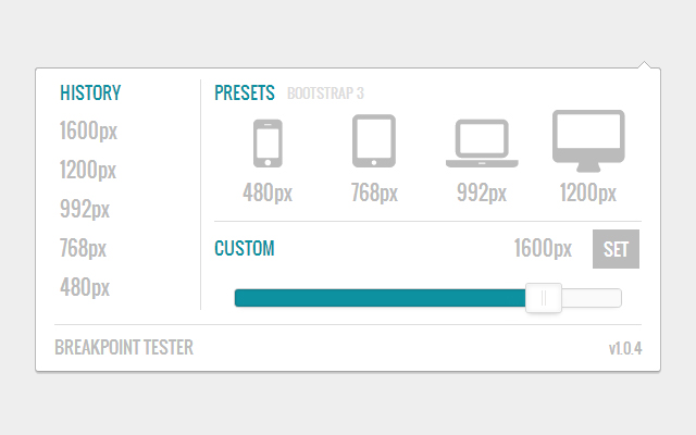
Breakpoint Tester is used to quickly and easily test the responsiveness of a website at various breakpoints. Breakpoint Tester ships with some sensible defaults to get you started off right but you're more than welcome to use your own custom breakpoints.
Breakpoint Tester uses the default media queries that ship with Bootstrap 3 as a baseline for it's breakpoint presets which are:
480px (Mobile)
768px (Tablet)
992px (Laptop)
1200px (Desktop)
Breakpoint Tester is open source and licensed under the MIT license. You are more than welcome to contribute to development, the project can be found on GitHub: https://github.com/JeffreyHyer/BreakpointTester
If you run into any issues or would like to request a new feature please do so either via the "Send Feedback" link in the Chrome Webstore or by opening a new GitHub issue. Feedback is both welcome and encouraged!
Latest reviews
- Sergio Vazquez II
- This extension does NOTHING. No matter what I click, NOTHING happens.
- 7b3n
- Great extension for web devs
- Vlad Ovchinnikov
- Does not take in account developer tools width :(
- Jay Sync
- very useful.. took me a bit to understand why the numbers where not updating when resizing but: - ALT+drag : will show the dimension when resizing - ALT+left/right arrow : will change window size by 1 px (not working 4 me bcs when i do that my browser goes up and down on history) - ALT+SHIFT+left/right arrow : will change window size by 10px
- Anonymous
- Great! Detectable and custom presets would be a great addition. Also, a reset action is needed to return the browser window back into its initial state before using the extension to resize.
- Private
- Awkward way of resizing the entire browser.
- Dylan Grant
- The breakpoints are a little off. For example, tablet is actually 766px.
- Number 9
- i love this..
- Oleg K
- super
- Trinity Kretz
- New update is horrible. It used to actually be useful - it would show you all the breakpoints in your code on one screen and let you see them side-by-side. Now it merely resizes your browser window.
- Joey Puopolo
- This new version is completely not helpful. It used to show the breakpoints already in your css. Now, all it does is resize your browser screen for you, which I can just do on my own. There's no reason for me to even use this.
- Jeffrey Vest
- Very well done. Very useful. Support for making the overlay smaller would be nice.
- Brad Green
- Useful tool for every web developer. See how your site looks/arranges on any device. Presets for common widths! Thanks!
- Tyler Snowden
- Very useful! No more dragging windows around to guess how your website will look like on mobile devices.