
Contrast Theme for Gmail™
Malware Detected
This extension has been flagged as potentially malicious.
Extension Delisted
This extension is no longer available in the official store. Delisted on 2025-09-15.
Extension Actions
- Minor Policy Violation
- Removed Long Ago
- Unpublished Long Ago
- No Privacy Policy
Make default Gmail™ New Look (2012) more readable by tweaking contrast, margins and borders.
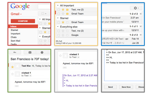
Tired to use the default Gmail New Look released in 2012? Wanted to use the original Gmail flavor?
Too many white spaces and less borders are actually not only reducing density but also readability.
It's time to use Contrast Theme for Gmail extension to improve your Gmail readability!
This Contrast Theme improves default Gmail New Look by tweaking color contrast, borders, shadows, margins and paddings.
Basically this theme works with any Gmail default themes in settings so you can keep using your favorite background and colors.
Also this extension provides switches to enable, disable extra features includes:
- Hide Ads.
- Use monospace font.
- Add a border to quotation like Mail.app does.
Latest reviews
- The Flokk
- nmm
- Carlos Heitor
- so falta aparecer o gmail para navegar. Certo
- Manikandan Beat
- Nice
- Tero Ykspetäjä
- Monospace font doesn't seem to work in the editor (when composing a plaintext email), otherwise a good theme, and I like getting my plain-text emails in monospace again!
- Jack Z
- Doesn't do anything.
- Nikki Hoskin
- It does not give instructions on how to use this extension